Python Matplotlib - Pie Chart - Avoid Labels Overlap
Python Matplotlib - Pie Chart - Avoid Labels Overlap
One of the common issues when creating pie charts is overlapping labels, especially when the chart has many slices or when the labels are long. Matplotlib provides several ways to handle this problem, allowing for clearer, more readable pie charts. In this tutorial, we will explore different techniques to avoid label overlap in a pie chart, ensuring that each label is properly displayed and the chart remains easy to understand.
Techniques to Avoid Label Overlap
There are various methods to avoid label overlap in pie charts. Some common techniques include:
- Adjusting the distance between labels and slices.
- Rotating the labels.
- Using
labeldistanceto adjust the label positions. - Using
pctdistanceto adjust percentage placement. - Using
autopctfor formatted display without labels.
Example 1: Adjusting Label Position Using labeldistance
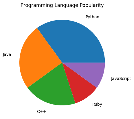
The labeldistance parameter allows you to adjust the position of labels in a pie chart. By increasing the distance between the labels and the slices, you can avoid overlap.
Example
import matplotlib.pyplot as plt

# Data for the pie chart
labels = ['Python', 'Java', 'C++', 'Ruby', 'JavaScript']
sizes = [35, 25, 20, 10, 10]

# Create pie chart with adjusted label distance
plt.pie(sizes, labels=labels, labeldistance=1.2)

# Add title
plt.title('Programming Language Popularity')

# Show the plot
plt.show()
Explanation
- We used the
labeldistance=1.2parameter to increase the distance between the labels and the slices. - This ensures that the labels are placed further out from the center of the pie chart, helping to avoid overlap.
- Adjusting the label distance can be particularly useful when dealing with a chart that has several slices with long labels.

Example 2: Rotating the Labels to Avoid Overlap
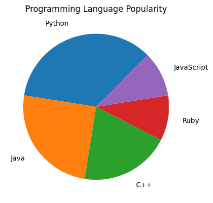
If the labels are still overlapping after adjusting the distance, rotating the labels can help in positioning them more effectively around the chart.
Example
import matplotlib.pyplot as plt

# Data for the pie chart
labels = ['Python', 'Java', 'C++', 'Ruby', 'JavaScript']
sizes = [35, 25, 20, 10, 10]

# Create pie chart with rotated labels
plt.pie(sizes, labels=labels, labeldistance=1.2, startangle=45)

# Add title
plt.title('Programming Language Popularity')

# Show the plot
plt.show()
Explanation
- The
startangle=45parameter rotates the entire pie chart to start at a different angle, which can help with label placement. - Rotating the labels or the chart can reduce the chances of overlap, especially when the slices are unevenly sized.
- This method is helpful when you want to control the angle at which the labels are placed and make the chart look more balanced.

Example 3: Use of Percentage Labels Only
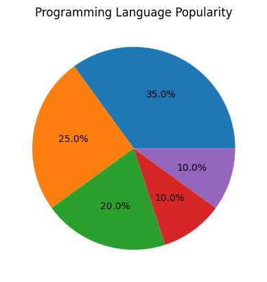
Sometimes, you may want to display only the percentages and avoid using labels altogether, which can help prevent overlap when there are many slices.
Example
import matplotlib.pyplot as plt

# Data for the pie chart
labels = ['Python', 'Java', 'C++', 'Ruby', 'JavaScript']
sizes = [35, 25, 20, 10, 10]

# Create pie chart with only percentages
plt.pie(sizes, autopct='%1.1f%%')

# Add title
plt.title('Programming Language Popularity')

# Show the plot
plt.show()
Explanation
- By using
autopct='%1.1f%%', the pie chart displays only the percentage values for each slice, omitting the labels. - This can be useful when you want to focus on the proportions of each slice rather than the labels, especially when the labels are very similar or unnecessary.

Example 4: Use of Exploded Slices for Better Clarity
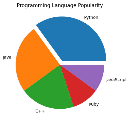
Exploding slices can help make the chart more readable by pulling a slice out from the chart, making it stand out and reducing the potential for overlap.
Example
import matplotlib.pyplot as plt

# Data for the pie chart
labels = ['Python', 'Java', 'C++', 'Ruby', 'JavaScript']
sizes = [35, 25, 20, 10, 10]

# Create pie chart with exploded slices
explode = (0.1, 0, 0, 0, 0)  # Explode the first slice
plt.pie(sizes, labels=labels, explode=explode)

# Add title
plt.title('Programming Language Popularity')

# Show the plot
plt.show()
Explanation
- The
explodeparameter allows you to pull slices out of the chart. In this case, we exploded the first slice (Python) to make it more prominent. - Exploding slices can help make the chart clearer, especially when there are many slices, as it adds space between the slices and makes them easier to read.

Summary
In this tutorial, we explored several techniques to avoid label overlap in Matplotlib pie charts:
- Adjusting label positions using
labeldistance. - Rotating the chart using
startanglefor better label placement. - Breaking long labels into multiple lines to avoid crowding.
- Using percentage labels instead of text labels to reduce overlap.
- Exploding slices to create space and improve readability.
By applying these techniques, you can ensure that your pie charts remain clean, legible, and effective in communicating your data.