Python Matplotlib - Pie Chart with Percentage Display
Pie Chart with Percentage Display
Displaying percentages in a pie chart is a common requirement when creating visualizations to provide clear insights into data distribution. Python's Matplotlib library offers an easy way to include and customize percentage values in pie charts. In this tutorial, we’ll explore how to:
- Display percentages in a pie chart.
- Customize the appearance and formatting of percentage values.
Basic Example: Displaying Percentages
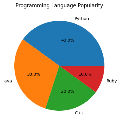
To display percentages in a pie chart, use the autopct parameter in the plt.pie() function:
import matplotlib.pyplot as plt

# Data for the pie chart
labels = ['Python', 'Java', 'C++', 'Ruby']
sizes = [40, 30, 20, 10]

# Create pie chart with percentages
plt.pie(sizes, labels=labels, autopct='%1.1f%%')

# Add title
plt.title('Programming Language Popularity')

# Show the plot
plt.show()
Explanation
- The
autopctparameter specifies how the percentage values should be displayed. Here,'%1.1f%%'means one decimal place followed by a percentage sign. - Percentages are automatically calculated based on the size of each slice.

Customizing Percentage Styles
You can customize the style of percentage values using various string formats or by passing a function to the autopct parameter.
Example 1: Different Decimal Places
To display percentages without decimal places:
import matplotlib.pyplot as plt

# Data for the pie chart
labels = ['Python', 'Java', 'C++', 'Ruby']
sizes = [40, 30, 20, 10]

# Create pie chart with rounded percentages
plt.pie(sizes, labels=labels, autopct='%1.0f%%')

# Add title
plt.title('Programming Language Popularity')

# Show the plot
plt.show()

Example 2: Custom Formatting Function for Decimal Places in Percentage
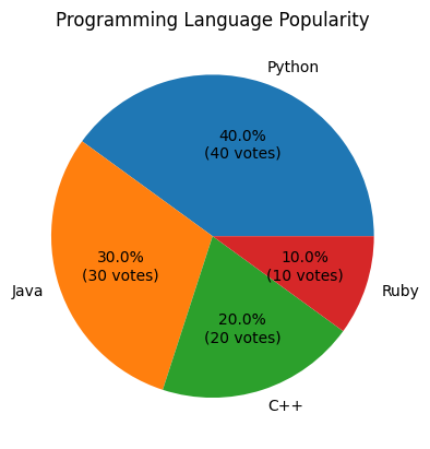
For more advanced customizations, you can use a custom function to control how percentages are displayed:
import matplotlib.pyplot as plt

# Data for the pie chart
labels = ['Python', 'Java', 'C++', 'Ruby']
sizes = [40, 30, 20, 10]

def format_percentage(pct, all_vals):
    absolute = int(round(pct/100.0*sum(all_vals)))
    return f"{pct:.1f}%\n({absolute} votes)"

# Create pie chart with custom percentage format
plt.pie(sizes, labels=labels, autopct=lambda pct: format_percentage(pct, sizes))

# Add title
plt.title('Programming Language Popularity')

# Show the plot
plt.show()
Explanation
- The
format_percentagefunction calculates both the percentage and absolute values, then returns a formatted string. - The
autopctparameter uses a lambda function to pass the percentage and total values toformat_percentage.

Customizing Text Appearance of Percentages in Pie-Chart
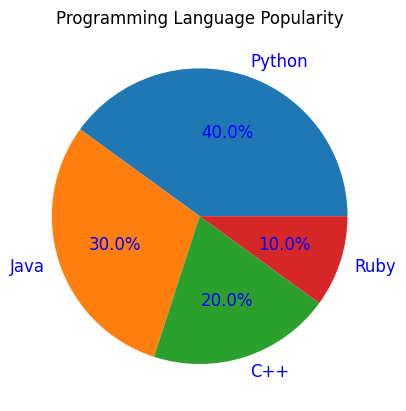
Matplotlib also allows you to change the font size, color, and style of the percentage labels using the textprops parameter.
import matplotlib.pyplot as plt

# Data for the pie chart
labels = ['Python', 'Java', 'C++', 'Ruby']
sizes = [40, 30, 20, 10]

# Create pie chart with customized text appearance
plt.pie(sizes, labels=labels, autopct='%1.1f%%', textprops={'fontsize': 12, 'color': 'blue'})

# Add title
plt.title('Programming Language Popularity')

# Show the plot
plt.show()
Explanation
fontsize: Adjusts the size of the percentage text.color: Changes the text color (e.g.,'blue').

Example: Multiple Pie Charts with Percentage Customizations
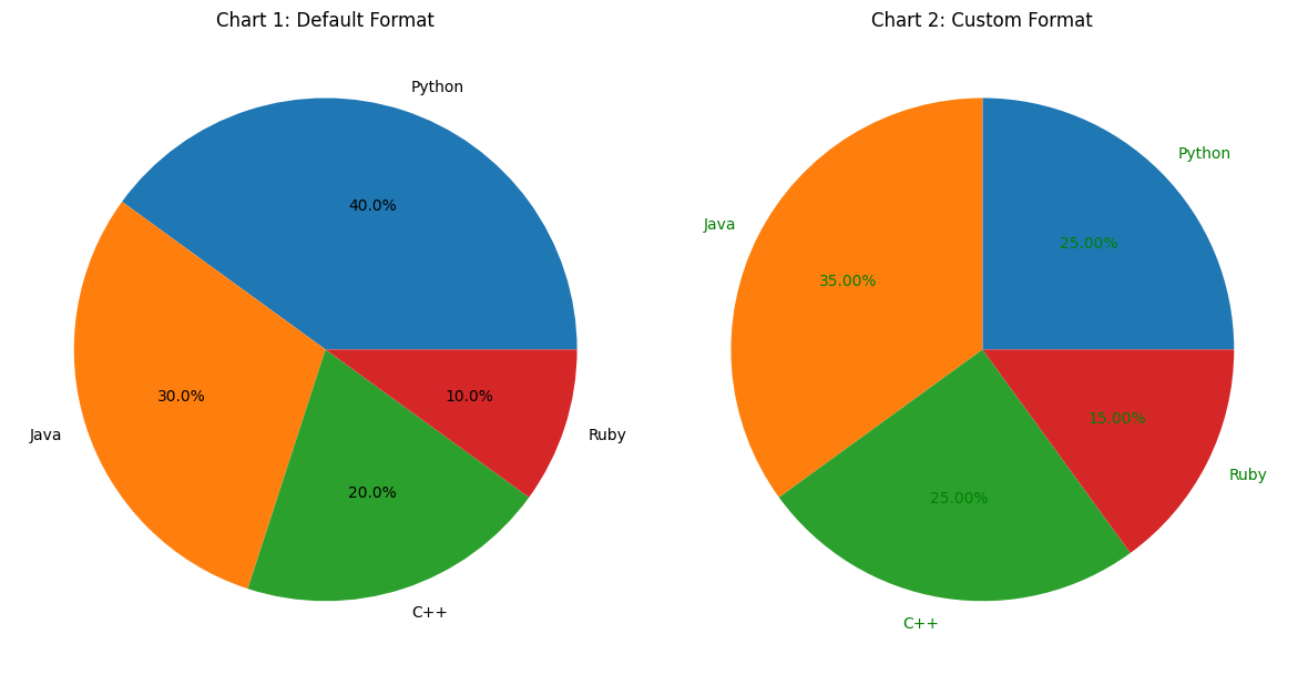
Here’s an example with two pie charts side-by-side, each with different percentage styles:
import matplotlib.pyplot as plt

# Data for the pie charts
labels = ['Python', 'Java', 'C++', 'Ruby']
sizes1 = [40, 30, 20, 10]
sizes2 = [25, 35, 25, 15]

# Create subplots
fig, axes = plt.subplots(1, 2, figsize=(12, 6))

# First pie chart with default percentage format
axes[0].pie(sizes1, labels=labels, autopct='%1.1f%%')
axes[0].set_title('Chart 1: Default Format')

# Second pie chart with custom formatting
axes[1].pie(sizes2, labels=labels, autopct=lambda pct: f"{pct:.2f}%", textprops={'fontsize': 10, 'color': 'green'})
axes[1].set_title('Chart 2: Custom Format')

# Adjust layout and show the plots
plt.tight_layout()
plt.show()
Explanation
- Two pie charts are created using the
axes[i].pie()method for different subplots. - The second pie chart uses a custom lambda function for percentage formatting and customized text appearance.

Summary
In this tutorial, we covered:
- How to display percentages in a pie chart using the
autopctparameter. - Different ways to customize the style and format of percentage values, including decimal places and custom formatting functions.
- Advanced text styling options with the
textpropsparameter.
By mastering these techniques, you can create highly customized and informative pie charts in Matplotlib.