How to set Bar Color(s) for Bar Chart in Matplotlib?
Matplotlib - Set Bar Color(s) for Bar Chart
To set color for bars in Bar chart in Matplotlib, set color parameter with required color value when calling bar() function.
We can provide a single color value, or a list of colors to the color parameter. We shall look into these scenarios in detail with examples.
We can provide inbuilt color values like 'red', 'green', 'yellow', etc., or a HEX value like '#FA08A5', '#140895', etc.
ax.bar(x, height, color='green')
ax.bar(x, height, color='#FA08A5')
ax.bar(x, height, color=['green', 'red'])
ax.bar(x, height, color=['green', '#256A96'])
Examples
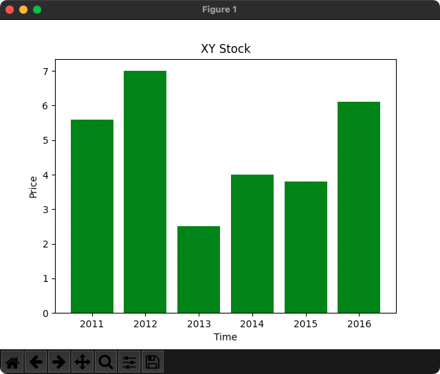
Single Color for All Bars
In the following example, we draw a bar plot with the color of all bars set to 'green'.
Python Program
import matplotlib.pyplot as plt

x = [2011, 2012, 2013, 2014, 2015, 2016]
height = [5.6, 7, 2.5, 4, 3.8, 6.1]

fig, ax = plt.subplots()

ax.bar(x, height, color='green')

ax.set_xlabel('Time')
ax.set_ylabel('Price')
ax.set_title('XY Stock')

plt.show()
Output
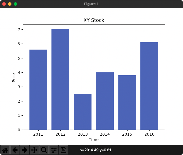
HEX Color
In the following example, we draw a bar plot with the color of all bars set to the HEX value 'green'.
Python Program
import matplotlib.pyplot as plt

x = [2011, 2012, 2013, 2014, 2015, 2016]
height = [5.6, 7, 2.5, 4, 3.8, 6.1]

fig, ax = plt.subplots()

ax.bar(x, height, color='#4958B5')

ax.set_xlabel('Time')
ax.set_ylabel('Price')
ax.set_title('XY Stock')

plt.show()
Output
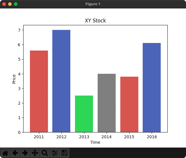
Different Colors for Bars
In the following example, we draw a bar plot with different colors for bars. The color parameter takes the color values as a list.
If the number of colors in the list is less than the number of bars, the colors from the beginning of the list are used in a cyclic manner.
Python Program
import matplotlib.pyplot as plt

x = [2011, 2012, 2013, 2014, 2015, 2016]
height = [5.6, 7, 2.5, 4, 3.8, 6.1]

fig, ax = plt.subplots()

ax.bar(x, height, color=['#C94845', '#4958B5', '#49D845', '#777777'])

ax.set_xlabel('Time')
ax.set_ylabel('Price')
ax.set_title('XY Stock')

plt.show()
Output
Summary
In this tutorial of Python Examples, we learned how to set color of bars in Bar Chart in Matplotlib.