Matplotlib - Scatter Plot Color based on Condition
Matplotlib - Scatter Plot Color based on Condition
In this tutorial, we'll explore how to customize the color of data points based on the condition formed with their values in a Matplotlib scatter plot.
The following is a step by step process for Scatter plot, where we choose one of the two colors 'red' or 'blue' for the data points, based on their values.
1. Import necessary libraries
Begin by importing the required Matplotlib library.
import matplotlib.pyplot as pltOptionally, you can also import NumPy for generating sample data.
import numpy as np2. Generate sample data
Create arrays of data points for the X and Y axes and an additional array for colors. For this example, we'll use NumPy to generate random data and assign colors based on conditions.
# Number of data points
num_points = 50

# Generate random values for X and Y
x_values = np.random.rand(num_points)
y_values = np.random.rand(num_points)
3. Assign colors based on conditions
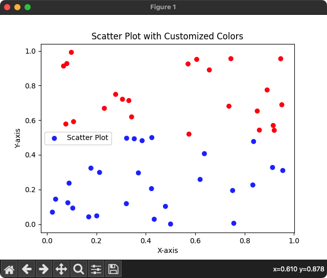
Create a numpy array with colors based on the condition: Y-axis value greater than 0.5. If Y-axis value is greater than 0.5, let us choose 'red' color, or if the condition is false, we shall choose 'blue' color.
# Assign colors based on conditions (e.g., higher or lower than a threshold)
colors = np.where(y_values > 0.5, 'red', 'blue')
4. Set Scatter Plot with customized colors
Use Matplotlib's scatter() function to create a scatter plot with the generated data points and customized colors.
# Create scatter plot with customized colors
plt.scatter(x_values, y_values, c=colors, label='Scatter Plot')
5. Customize and show the plot
Customize the plot by adding a title, labels for the X and Y axes, and a legend. Finally, display the plot using show().
# Customize the plot
plt.title('Scatter Plot with Customized Colors')
plt.xlabel('X-axis')
plt.ylabel('Y-axis')
plt.legend()

# Show the plot
plt.show()
Complete Program
Let us put all the above mentioned steps together, and write a program for a scatter plot where the data points are colored 'red' or 'blue' based on the condition applied on data points.
Python Program
import matplotlib.pyplot as plt
import numpy as np

# Number of data points
num_points = 50

# Generate random values for X and Y
x_values = np.random.rand(num_points)
y_values = np.random.rand(num_points)

# Assign colors based on conditions (e.g., higher or lower than a threshold)
colors = np.where(y_values > 0.5, 'red', 'blue')

# Create scatter plot with customized colors
plt.scatter(x_values, y_values, c=colors, label='Scatter Plot')

# Customize the plot
plt.title('Scatter Plot with Customized Colors')
plt.xlabel('X-axis')
plt.ylabel('Y-axis')
plt.legend()

# Show the plot
plt.show()
Output
Summary
This tutorial demonstrated how to customize the color of data points in a Matplotlib scatter plot, based on a condition, providing a visual distinction between different patterns within the data.