Matplotlib - Bar Chart
Matplotlib - Bar Chart
To draw a Bar chart using Matplotlib, use bar() function of maplotlib.pyplot package.
Example
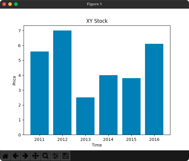
In the following example, we draw the price chart of XY stock with time.
Python Program
import matplotlib.pyplot as plt

x = [2011, 2012, 2013, 2014, 2015, 2016]
height = [5.6, 7, 2.5, 4, 3.8, 6.1]

fig, ax = plt.subplots()

ax.bar(x, height)

ax.set_xlabel('Time')
ax.set_ylabel('Price')
ax.set_title('XY Stock')

plt.show()
Output
Summary
In this tutorial of Python Examples, we learned how to draw a Bar Chart using Matplotlib.