Python Matplotlib - Bar Plot Rotate Labels
Python Matplotlib - Bar Plot Rotate Labels
In bar plots, the readability of labels is essential, especially when dealing with long or numerous categories. In this tutorial, we will guide you through various methods to rotate and customize labels in Matplotlib bar plots.
Basic Label Rotation
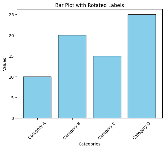
Rotating x-axis labels can prevent overlap and enhance clarity when categories have lengthy names or are densely packed.
Example 1: Basic Label Rotation
import matplotlib.pyplot as plt

# Data for the bar plot
categories = ['Category A', 'Category B', 'Category C', 'Category D']
values = [10, 20, 15, 25]

# Create the bar plot
plt.bar(categories, values, color='skyblue', edgecolor='black')

# Rotate x-axis labels
plt.xticks(rotation=45)

# Add labels and title
plt.xlabel('Categories')
plt.ylabel('Values')
plt.title('Bar Plot with Rotated Labels')

# Show the plot
plt.show()
Explanation
- The
plt.xticks(rotation=45)function rotates the x-axis labels by 45 degrees. - This prevents label overlap and improves readability for longer text.
- The bar plot is styled with a light blue fill and black edges for better contrast.

Rotating Labels with Alignment
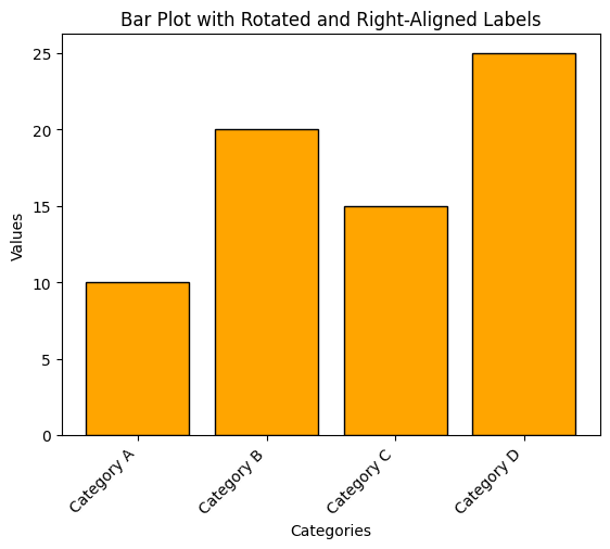
In some cases, aligning the rotated labels further enhances readability. You can use the ha parameter to adjust alignment.
Example 2: Rotating Labels with Right Alignment
import matplotlib.pyplot as plt

# Data for the bar plot
categories = ['Category A', 'Category B', 'Category C', 'Category D']
values = [10, 20, 15, 25]

# Create the bar plot
plt.bar(categories, values, color='orange', edgecolor='black')

# Rotate and align x-axis labels
plt.xticks(rotation=45, ha='right')

# Add labels and title
plt.xlabel('Categories')
plt.ylabel('Values')
plt.title('Bar Plot with Rotated and Right-Aligned Labels')

# Show the plot
plt.show()
Explanation
- The
ha='right'parameter aligns the labels to the right. - Rotating and aligning the labels ensures they are fully visible and legible.

Customizing Font and Rotation Together
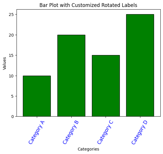
To further enhance the visual appearance of the rotated labels, you can customize the font size and style along with the rotation angle.
Example 3: Custom Font and Rotation
import matplotlib.pyplot as plt

# Data for the bar plot
categories = ['Category A', 'Category B', 'Category C', 'Category D']
values = [10, 20, 15, 25]

# Create the bar plot
plt.bar(categories, values, color='green', edgecolor='black')

# Rotate and customize x-axis labels
plt.xticks(rotation=60, fontsize=12, color='blue')

# Add labels and title
plt.xlabel('Categories')
plt.ylabel('Values')
plt.title('Bar Plot with Customized Rotated Labels')

# Show the plot
plt.show()
Explanation
- The
rotation=60parameter rotates the labels by 60 degrees. - The
fontsizeparameter adjusts the size of the labels for better visibility. - The
color='blue'parameter changes the label color for aesthetic purposes.

Summary
In this tutorial, we explored:
- How to rotate labels in a bar plot using
plt.xticks. - Aligning rotated labels with the
haparameter. - Customizing font size, rotation angle, and color for better readability.
Rotating and customizing x-axis labels is a simple yet effective way to enhance the clarity and aesthetics of your bar plots. Experiment with these techniques to find the perfect style for your data visualization needs.