Python Matplotlib - Bar Plot X-axis Labels
Python Matplotlib - Bar Plot X-axis Labels
Bar plots are commonly used to visualize categorical data, making x-axis labels an essential part of their readability. Matplotlib provides several options for customizing x-axis labels, including adjusting their rotation, font size, alignment, and more. This tutorial will guide you through various techniques for enhancing x-axis labels in bar plots with practical examples.
Basic X-axis Label Customization
You can set the x-axis labels using the xticks function in Matplotlib, which allows customization such as rotation and font size.
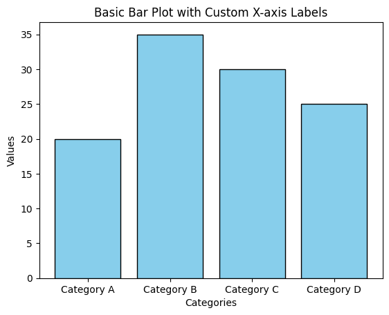
Example 1: Basic Bar Plot with Custom Labels
import matplotlib.pyplot as plt

# Data for the bar plot
categories = ['Category A', 'Category B', 'Category C', 'Category D']
values = [20, 35, 30, 25]

# Create bar plot
plt.bar(categories, values, color='skyblue', edgecolor='black')

# Add labels and title
plt.xlabel('Categories')
plt.ylabel('Values')
plt.title('Basic Bar Plot with Custom X-axis Labels')

# Show the plot
plt.show()
Explanation
- The
categorieslist defines the x-axis labels for the bar plot. plt.xlabelis used to add a label to the x-axis.- The x-axis labels are automatically displayed based on the
categoriesprovided toplt.bar.
Rotating X-axis Labels
Rotating x-axis labels can improve readability, especially when dealing with long labels or densely packed categories.
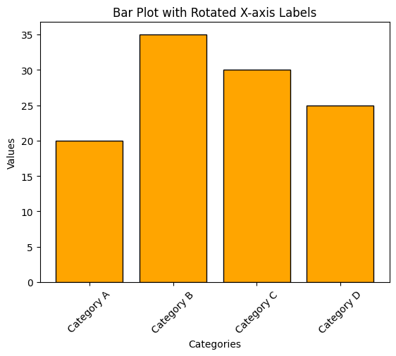
Example 2: Rotated X-axis Labels
import matplotlib.pyplot as plt

# Data for the bar plot
categories = ['Category A', 'Category B', 'Category C', 'Category D']
values = [20, 35, 30, 25]

# Create bar plot
plt.bar(categories, values, color='orange', edgecolor='black')

# Rotate x-axis labels
plt.xticks(rotation=45)

# Add labels and title
plt.xlabel('Categories')
plt.ylabel('Values')
plt.title('Bar Plot with Rotated X-axis Labels')

# Show the plot
plt.show()
Explanation
- The
plt.xticksfunction is used to rotate the x-axis labels by 45 degrees. - Rotating the labels helps to prevent overlap and makes the chart more readable.
Customizing Font Size and Alignment
You can customize the font size and alignment of the x-axis labels for better clarity or specific design needs.
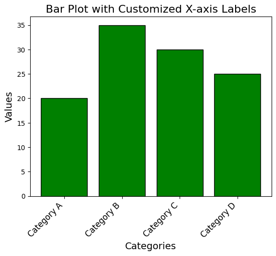
Example 3: Custom Font Size and Alignment
import matplotlib.pyplot as plt

# Data for the bar plot
categories = ['Category A', 'Category B', 'Category C', 'Category D']
values = [20, 35, 30, 25]

# Create bar plot
plt.bar(categories, values, color='green', edgecolor='black')

# Customize x-axis labels
plt.xticks(fontsize=12, ha='right', rotation=45)

# Add labels and title
plt.xlabel('Categories', fontsize=14)
plt.ylabel('Values', fontsize=14)
plt.title('Bar Plot with Customized X-axis Labels', fontsize=16)

# Show the plot
plt.show()
Explanation
fontsizeinplt.xticksadjusts the font size of the x-axis labels.ha='right'aligns the labels to the right.- The
rotationparameter is also used to tilt the labels for improved readability.
Advanced Formatting with Manual Label Placement
For advanced use cases, you may want to manually place and format x-axis labels for complete control.
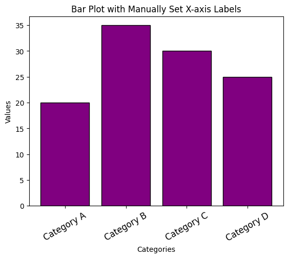
Example 4: Manually Setting X-axis Labels
import matplotlib.pyplot as plt

# Data for the bar plot
categories = ['Category A', 'Category B', 'Category C', 'Category D']
values = [20, 35, 30, 25]
x_positions = [1, 2, 3, 4]

# Create bar plot with custom x-axis positions
plt.bar(x_positions, values, color='purple', edgecolor='black', tick_label=categories)

# Customize labels
plt.xticks(x_positions, labels=categories, fontsize=12, rotation=30, ha='center')

# Add labels and title
plt.xlabel('Categories')
plt.ylabel('Values')
plt.title('Bar Plot with Manually Set X-axis Labels')

# Show the plot
plt.show()
Explanation
- The
x_positionslist defines the positions of the bars on the x-axis. tick_labelinplt.barassigns custom labels to the specified x-axis positions.plt.xticksfurther customizes the labels with font size, rotation, and alignment.
Summary
In this tutorial, we explored:
- How to set and customize x-axis labels in a bar plot.
- Rotating x-axis labels to enhance readability.
- Adjusting font size and alignment for better aesthetics.
- Manually setting x-axis labels for complete control over formatting.
Customizing x-axis labels is a simple yet effective way to make your bar plots more informative and visually appealing. Experiment with these techniques to optimize your data visualizations.