Python Matplotlib - Pie Chart Colors
Python Matplotlib - Pie Chart Colors
Customizing the colors of your pie chart slices is a great way to make your chart more visually appealing and meaningful. In this tutorial, we will explore various ways to modify the colors of the slices in a pie chart using Python's Matplotlib library.
Prerequisites
To follow along with this tutorial, you need to have the following Python libraries installed:
- Matplotlib: For creating the pie chart.
- Pandas: For handling data in a DataFrame (optional).
If you haven't installed these libraries yet, you can do so by running:
pip install matplotlib pandas
Basic Pie Chart with Default Colors
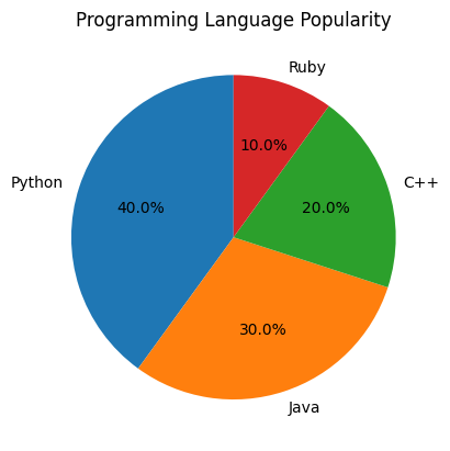
By default, Matplotlib assigns different colors to the slices of a pie chart. Let's first create a simple pie chart without any custom colors.
Example: Basic Pie Chart
import matplotlib.pyplot as plt

# Data for the pie chart
labels = ['Python', 'Java', 'C++', 'Ruby']
sizes = [40, 30, 20, 10]

# Create a pie chart with default colors
plt.pie(sizes, labels=labels, autopct='%1.1f%%', startangle=90)

# Add title
plt.title('Programming Language Popularity')

# Show the plot
plt.show()
Explanation
- The pie chart is generated using the
plt.pie()function with default colors assigned to each slice. - Each slice represents a programming language, and the percentages are shown next to the slices.

Customizing Pie Chart Colors
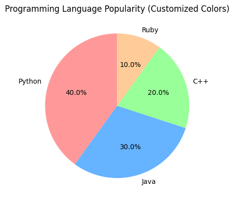
Matplotlib allows you to customize the colors of the pie chart slices by providing a list of color values. These values can be named colors, hexadecimal color codes, or RGB values.
Example: Customizing Colors
import matplotlib.pyplot as plt

# Data for the pie chart
labels = ['Python', 'Java', 'C++', 'Ruby']
sizes = [40, 30, 20, 10]

# Define custom colors for each slice
colors = ['#ff9999', '#66b3ff', '#99ff99', '#ffcc99']

# Create a pie chart with custom colors
plt.pie(sizes, labels=labels, autopct='%1.1f%%', startangle=90, colors=colors)

# Add title
plt.title('Programming Language Popularity (Customized Colors)')

# Show the plot
plt.show()
Explanation
- We defined a list of custom colors using hexadecimal color codes.
- These colors were applied to the pie chart slices using the
colorsparameter. - This allows for better visual distinction between the slices and a more tailored appearance.

Using Predefined Color Palettes
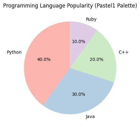
Matplotlib comes with several predefined color palettes that can be used to easily apply a consistent set of colors to your pie chart slices. These palettes are part of Matplotlib's color module.
Example: Using 'Pastel1' Color Palette
import matplotlib.pyplot as plt

# Data for the pie chart
labels = ['Python', 'Java', 'C++', 'Ruby']
sizes = [40, 30, 20, 10]

# Use a predefined color palette
colors = plt.cm.Pastel1(range(len(labels)))

# Create a pie chart with the 'Pastel1' color palette
plt.pie(sizes, labels=labels, autopct='%1.1f%%', startangle=90, colors=colors)

# Add title
plt.title('Programming Language Popularity (Pastel1 Palette)')

# Show the plot
plt.show()
Explanation
- We used
plt.cm.Pastel1to access the predefined 'Pastel1' color palette and passed it to thecolorsparameter. - Matplotlib's
cmmodule provides a variety of color maps that can be used for different types of visualizations. - This method automatically generates a range of colors based on the number of labels in the chart.

Dynamically Creating Colors Based on Data
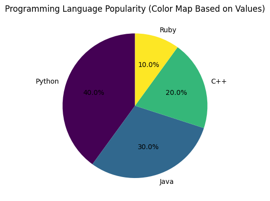
You can also generate a color palette dynamically based on the values in your data. For example, using a color map to vary the slice colors based on the size of the values.
Example: Color Map Based on Values
import matplotlib.pyplot as plt
import numpy as np

# Data for the pie chart
labels = ['Python', 'Java', 'C++', 'Ruby']
sizes = [40, 30, 20, 10]

# Generate a color map based on the sizes
colors = plt.cm.viridis(np.linspace(0, 1, len(sizes)))

# Create a pie chart with colors based on values
plt.pie(sizes, labels=labels, autopct='%1.1f%%', startangle=90, colors=colors)

# Add title
plt.title('Programming Language Popularity (Color Map Based on Values)')

# Show the plot
plt.show()
Explanation
- We used
np.linspace(0, 1, len(sizes))to create a range of values between 0 and 1, and then applied it to theplt.cm.viridiscolor map. - The color map dynamically assigns colors based on the relative sizes of the values in
sizes. - This approach can help represent the magnitude of the data visually, making the chart easier to interpret.

Summary
In this tutorial, we learned how to:
- Plot a basic pie chart using default colors.
- Customize the colors of pie chart slices using hexadecimal values.
- Use predefined color palettes in Matplotlib to apply consistent colors.
- Generate colors dynamically using color maps based on data values.
By adjusting the colors of your pie chart slices, you can create a more visually appealing and informative chart. Whether you're using static color values or color maps, the ability to control colors helps you better communicate your data.