Python Matplotlib - Pie Chart with Percentage and Value
Matplotlib - Pie Chart with Percentage and Value
Pie charts are an excellent way to visualize data proportions. While percentages are often displayed, showing the actual values alongside percentages can add more clarity and depth to your chart. Python's Matplotlib library allows you to achieve this easily. This tutorial will guide you through:
- Displaying both percentages and values in a pie chart.
- Customizing the display format for percentages and values.
Displaying Percentages and Values
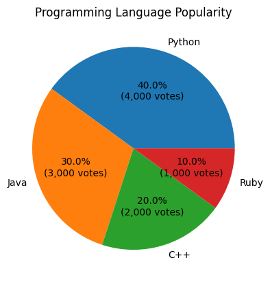
You can use a custom function with the autopct parameter in plt.pie() to display both percentages and values.
Example 1: Basic Implementation
import matplotlib.pyplot as plt

# Data for the pie chart (votes in thousands)
labels = ['Python', 'Java', 'C++', 'Ruby']
votes = [4000, 3000, 2000, 1000]

def format_pie(pct, all_vals):
    absolute = int(round(pct/100.0 * sum(all_vals)))
    return f"{pct:.1f}%\n({absolute:,} votes)"

# Create pie chart with percentages and values
plt.pie(votes, labels=labels, autopct=lambda pct: format_pie(pct, votes))

# Add title
plt.title('Programming Language Popularity')

# Show the plot
plt.show()
Explanation
- The
format_piefunction calculates both percentage and absolute value in terms of votes (in thousands). autopctis set to a lambda function that passes the percentage and total values toformat_pie.- Each slice displays the percentage and corresponding value.

Customizing Text Formatting for Percentages and Values in Pie-Chart
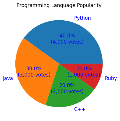
Matplotlib allows you to adjust the text size, color, and alignment for better readability.
Example 2: Text Customization for for Percentages and Values in Pie-Chart
import matplotlib.pyplot as plt

# Data for the pie chart (votes in thousands)
labels = ['Python', 'Java', 'C++', 'Ruby']
votes = [4000, 3000, 2000, 1000]

def format_pie(pct, all_vals):
    absolute = int(round(pct/100.0 * sum(all_vals)))
    return f"{pct:.1f}%\n({absolute:,} votes)"

# Create pie chart with customized text appearance
plt.pie(votes, labels=labels, autopct=lambda pct: format_pie(pct, votes),
        textprops={'fontsize': 12, 'color': 'blue'})

# Add title
plt.title('Programming Language Popularity')

# Show the plot
plt.show()
Explanation
- The
textpropsparameter modifies the font size and color of the text to make it more readable. - Text customization ensures the labels and values are visually appealing and easy to read.

Example 3: Multiple Pie Charts with Percentage and Value
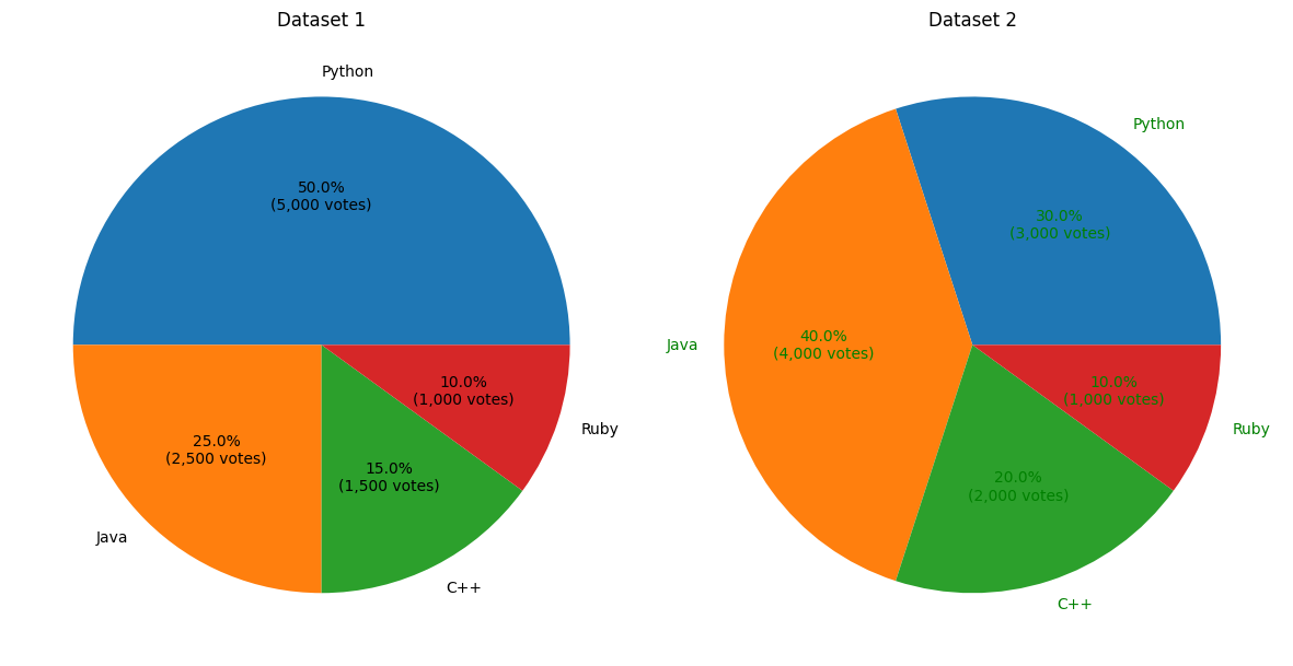
You can create multiple pie charts to compare datasets while displaying percentages and values.
import matplotlib.pyplot as plt

# Data for the pie charts (votes in thousands)
labels = ['Python', 'Java', 'C++', 'Ruby']
votes1 = [5000, 2500, 1500, 1000]
votes2 = [3000, 4000, 2000, 1000]

def format_pie(pct, all_vals):
    absolute = int(round(pct/100.0 * sum(all_vals)))
    return f"{pct:.1f}%\n({absolute:,} votes)"

# Create subplots
fig, axes = plt.subplots(1, 2, figsize=(12, 6))

# First pie chart
axes[0].pie(votes1, labels=labels, autopct=lambda pct: format_pie(pct, votes1))
axes[0].set_title('Dataset 1')

# Second pie chart
axes[1].pie(votes2, labels=labels, autopct=lambda pct: format_pie(pct, votes2),
            textprops={'fontsize': 10, 'color': 'green'})
axes[1].set_title('Dataset 2')

# Adjust layout and show the plots
plt.tight_layout()
plt.show()
Explanation
fig, axescreates two subplots side by side, each with a different dataset.- Each subplot applies the same
format_piefunction for percentage and value display, showing votes in thousands. - Text appearance for the second chart is customized for better distinction using the
textpropsparameter.

Summary
In this tutorial, we explored:
- How to display both percentages and values (votes in thousands) in a pie chart using a custom function.
- Customizing the appearance of text using the
textpropsparameter. - Creating multiple pie charts to compare datasets effectively.
By combining percentages and values, your pie charts can provide more comprehensive insights into your data, especially when visualizing vote-based or count-based data.