Python Matplotlib - Overlaying or Arranging Stackplots Side by Side for Comparisons
Python Matplotlib - Overlaying or Arranging Stackplots Side by Side for Comparisons
Stackplots are excellent tools for visualizing cumulative data trends over time. When comparing multiple datasets, arranging or overlaying stackplots can provide clarity and highlight differences effectively.
This tutorial covers:
- Overlaying stackplots to highlight differences between datasets.
- Arranging stackplots side by side for easier comparisons.
Overlaying Stackplots
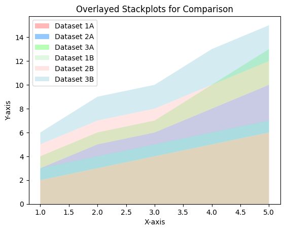
Overlaying stackplots allows you to visualize multiple datasets in a single plot, making it easier to identify overlaps and trends.
Example 1: Overlaying Stackplots
import matplotlib.pyplot as plt

# Data for the first stack plot
x = [1, 2, 3, 4, 5]
y1 = [2, 3, 4, 5, 6]
y2 = [1, 2, 2, 3, 4]
y3 = [1, 1, 1, 2, 3]

# Data for the second stack plot
y4 = [3, 4, 5, 6, 7]
y5 = [2, 3, 3, 4, 5]
y6 = [1, 2, 2, 3, 3]

# Create overlaying stackplots
plt.stackplot(x, y1, y2, y3, alpha=0.7, labels=['Dataset 1A', 'Dataset 2A', 'Dataset 3A'], colors=['#ff9999', '#66b3ff', '#99ff99'])
plt.stackplot(x, y4, y5, y6, alpha=0.5, labels=['Dataset 1B', 'Dataset 2B', 'Dataset 3B'], colors=['#c2f0c2', '#ffcccb', '#add8e6'])

# Add labels and title
plt.xlabel('X-axis')
plt.ylabel('Y-axis')
plt.title('Overlayed Stackplots for Comparison')

# Add a legend
plt.legend(loc='upper left')

# Show the plot
plt.show()
Explanation
- Two stackplots are drawn on the same axes with different colors and transparency levels using the
alphaparameter. - The transparency helps visualize overlapping areas.

Arranging Stackplots Side by Side
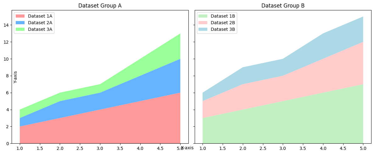
Arranging stackplots side by side makes it easier to compare datasets without overlapping them, providing a clear view of individual trends.
Example 2: Side-by-Side Stackplots
import matplotlib.pyplot as plt

# Data for the first stack plot
x = [1, 2, 3, 4, 5]
y1 = [2, 3, 4, 5, 6]
y2 = [1, 2, 2, 3, 4]
y3 = [1, 1, 1, 2, 3]

# Data for the second stack plot
y4 = [3, 4, 5, 6, 7]
y5 = [2, 3, 3, 4, 5]
y6 = [1, 2, 2, 3, 3]

# Create side-by-side stackplots
fig, axes = plt.subplots(1, 2, figsize=(12, 5), sharey=True)

# First stackplot
axes[0].stackplot(x, y1, y2, y3, labels=['Dataset 1A', 'Dataset 2A', 'Dataset 3A'], colors=['#ff9999', '#66b3ff', '#99ff99'])
axes[0].set_title('Dataset Group A')
axes[0].legend(loc='upper left')

# Second stackplot
axes[1].stackplot(x, y4, y5, y6, labels=['Dataset 1B', 'Dataset 2B', 'Dataset 3B'], colors=['#c2f0c2', '#ffcccb', '#add8e6'])
axes[1].set_title('Dataset Group B')
axes[1].legend(loc='upper left')

# Add common labels
fig.text(0.5, 0.04, 'X-axis', ha='center')
fig.text(0.04, 0.5, 'Y-axis', va='center', rotation='vertical')

# Show the plots
plt.tight_layout()
plt.show()
Explanation
- Two subplots are created using
plt.subplots(), arranged side by side. - Each subplot contains a stackplot, allowing a direct comparison of datasets without overlap.

Summary
In this tutorial, we explored:
- How to overlay stackplots to compare datasets on a single plot.
- Arranging stackplots side by side for clearer comparisons.
Choosing the appropriate visualization method depends on the nature of the datasets and the type of comparison needed.